
I am fortunate enough to work for a school that provides teachers with some pretty neat tools for instructional design and student interaction. I teach an on campus iteration of Professional Communication and Presentation (PCP) six times per year. In addition, I also teach one to three sections of the online version of PCP. While I work on both the online and campus classes, in the past six to nine months, the PCP team has been tweaking and retweaking the online course. Teaching public speaking and presentation online is often the pits! How does one create the level of engagement and immersion needed to really help a student internalize weeks worth of material in only 60 hours, or 4 weeks? Well, in some cases, the answer is still forthcoming, but thankfully, I am able to at least engage with my students directly each week through our GoTo Trainings. If you aren’t familiar with Citrix’s GoTo Meeting, it’s becoming the industry leader for synchronous remote meetings, and it’s exclusively used by my school for internal meetings, workshops, and virtual classroom meetings/lectures. The service isn’t perfect and its inability to handle my media rich video archives has caused me to get creative with distributing the session to those who cannot attend it live, but the chance to interact with students and to clarify assignments, lessons, and intentions is invaluable to myself and other online educators. In PCP, I am responsible for holding the GoTo sessions for weeks 3 and 4. Week 3 covers the delivery “leg” of the presentation stool: what REAL Delivery means, how some of the more important aspects of that model fit into an online structure, some best practices for how to rehearse for the students’ upcoming Ignite presentation, and an open Q & A.
In preparation for this one-hour session, I have to adapt the unity and structure of my already existing REAL Delivery deck to fit this structure (as opposed to the structure of a four-eight hour block of class). The exercise leads me to think about two important lessons related to 1. design and 2. organization. In this post, I’ll cover the first lesson:
SIMPLE Design: Make Unity a Priority

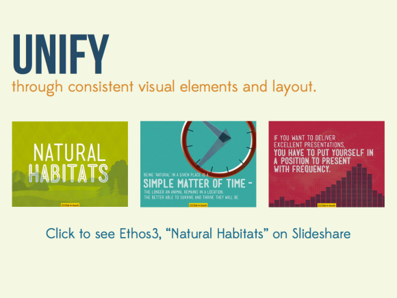
Although this deck is a hybrid of my Conquering Presentation and REAL Delivery decks, AND the inclusion of a few class-specific elements, my goal in creating a visual aid to accompany this session is to use unity–the repetition of key elements like color, text, background, shape, and image style–to communicate how this piece of the students’ learning journey fits into the whole. For most of us, unity means choosing a pre-made template and adding elements.

Templates are wonderful examples of how unity actually works (choose key elements, repeat and variate on a theme) and why unity is important (consistency helps reduce confusion and puts the focus on content and meaning, not visual fluff). Unfortunately, the limited number of templates, combined with our ingrained use of presentation software (open program, choose template) makes templates cliche, watered-down versions of unity.

To make unity a priority, focus on taking the idea of a template (repetition) and making it your own. Instead of using someone else’s vision to communicate your concept in a way that is instantly forgettable, use repeated elements to create a unified theme that communicates your concept in an original way.
Here are a few best practices for choosing two of those key repeated elements, type and color.
Typefaces:

Focus on readability and consistency; your fancy font may be right in line with your topic and theme, but if your audience cannot read it, what’s the point? I cycled through several different choices for REAL Delivery, including my standby, Bebas Neue. I chose Utility all caps because I preferred the heavier weight and thickness when paired with Edmondsans. However, I found that not spacing my letters out somewhat (kerning) made readability a problem. So, when choosing a typeface, integrating it into your design and combining it with your other elements, remember the following:

Finally, if you have the option of using a font or typeface beyond what is already included in your software, a great place to start is FontSquirrel:
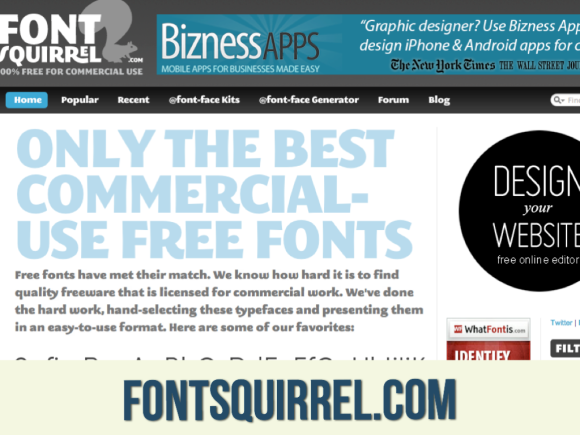
Font Squirrel is one of my favorite sources for commercially-available typefaces and fonts. Their selections are high-quality, carefully selected, and lovely!
Color:

A second important element to consider in creating your own unity or making unity a priority is color. Here are three useful tips on choosing color from Ethos 3’s Color Matters:


One final tip is to use a great color generator, such as design-seeds, which Alex Rister recently discussed on Creating Communication. Here are two of my other favorite color generators/color tools:

Check in tomorrow for the second lesson from my GoTo Training experience: Murdering Your Darlings. Next week, we will move on to the P in SIMPLE Design, Pictures are Superior!
Check out the rest of the SIMPLE Design series below:
