The picture superiority effect occurs when you combine visuals and text together to increase audience retention of your message. The picture superiority effect is what allows you to create one of Nancy Duarte’s STAR Moments, evocative visuals. Not every visual needs to utilize text; Lisa Kristine in her amazing TED talk uses no text on her images; using text over her haunting and beautiful images of human slaves would have diminished their impact. However, text, especially in stand-alone presentations can help enhance a slide, communicate a more impacting message, and add to that cohesive look we want from original slide decks.
There are a few ways to blend text and image together on a slide. What you do depends on what you want to accomplish, the nature of your image and the amount of text on your slide. Your choice depends on what your main focus is in displaying the word with the image. Are they equally important? Is one more important than another? Here are a few variations to get you started.Below, I’ll cover a few of the more common combinations I see from designers and students. There are several ways to combine a bit of text with an image. Here are a few variations to get you started.
One idea, one image with empty space
One way to combine an image with an idea is to look for an image that has empty space. Often, images that employ the rule of thirds include enough space for text. You know there’s enough space when there is little to no overlap between image and text. In this example, the original image by Flickr user Photoco. was licensed for commercial use with adaptations or remixes allowed. I was able to fill the slide with the image (which was large enough to display without pixelation) and use the empty space to the left of the figure to add my idea.

One idea, one image without empty space
In other situations, you might have a fairly busy image you’d like to use on your slide; there is no one specific detail in the image that is more important than another that must be visible as in the example above. So, you can use a few strategies to blend image and text. The first is to adjust the brightness and exposure of the original image and place one large word over the picture (fig. a); note that this works well with a typeface like Intro, but might not work well with a typeface that has a thinner weight. In the first two examples (fig. a, fig. b), I adjusted the brightness and exposure of the image. In the next, I added a shadow to differentiate the text from the background (fig. c). In the final example, I adjusted the opacity of the text (this sometimes improves readability) (fig. d). Notice that the color changes depending on the option.
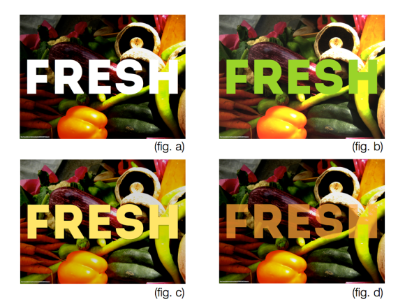
After tweaking colors, shadows, and image settings, I chose this variation:

Now, let’s assume you want to use a font with a thinner weight, like District Pro. Notice that without a bit of help, the text here is difficult to read. This is where a supporting shape comes in. Placing a shape behind the text (as long as it doesn’t make an important element on the image impossible to see) can be an option when blending text and image. In the example below, I’ve used several shapes to emphasize the text.

One quote, one image with empty space
So, what if you want to place a quote or a lengthier idea (keep words to a minimum on a slide; 5-8 words is enough) on a slide with an image? Your first and best bet is to seek out an image with empty space, like the one above. Using an image with empty space and a readable typeface will help you maximize the impact of the quote by providing simple, clean visual support.

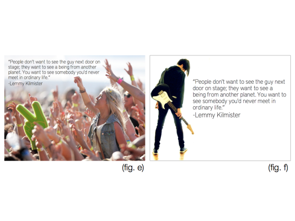
One quote, one image without empty space a quote
At times, it’s possible to place a quote on a slide that has is busier–again, as long as the quote does not interfere with important parts of the image. However, this is the option I would advise the least. Placing a quote on a slide with a busy image will increase your chances of creating noise and it could minimize signal. In the case below, the quote on the slide combined with the image creates noise.

The solution here is to rearrange the image to fit the frame (fig. e), find an image that allows the blend to happen naturally (fig. f), or allow the quote to stand alone.
These are only a few of the many ways to blend text and image together.Whatever your choice, it’s important to consider these three best practices when pairing text and image:
1. The picture superiority effect is maximized when text and image are blended.
2. Create the most seamless blend possible.
3. Keep signal high and noise low.
What are your go to strategies for maximizing the picture superiority effect?