

The Simple Design series will cover the basics of strong presentation design. The first part in the series is an introduction to the concept of simplicity in design and what that truly means when it comes to creating strong visual aids.
Often, when I consult with students, teachers, and professionals on presentation design, the subject of simplicity comes up. The idea that something complex should at the same time be simple can be a road block for novice presentation designers, particularly because we are so conditioned through misuse of presentation software to fill up every available inch of presentation “real estate” with bullets, clip art, non-sensical diagrams, doo dads, fire animations, wingdings, company logos, word art, and any other number of PowerPoint distractions. Imagine if Abraham Lincoln had used PowerPoint? What would we actually remember about The Gettysburg Address.
Simplicity is a powerful element to creating strong visual aids. Further, simplicity is something we crave, something we are now primed to seek out as we are driven to seek out meaning. Simplicity is the key to meaning; it allows your audience to move past noise directly to signal. But, simplicity isn’t simple or easy. John Madea, president of the Rhode Island School of Design, understands the power of simplicity first hand; in fact, he wrote the book on it. In his 2007 TED talk, “Designing for Simplicity”, Madea dissects the intersection of simplicity and complexity; simplicity is complexity, but it’s complexity at its most elegant and meaningful.
For Madea, simplicity is a part of the human experience; it’s about living life with more joy and less pain. But, simplicity isn’t simple, which is where design comes in. Design is the intersection of art and technology, the simple presentation of the infinitely complex human experience. At its best, design is about simplicity because design is about focusing on the meaningful. In a world of death-by-PowerPoint, this idea of simple design is even more important in the creation of visual aids and slideshows. Why? Because at the core, slides are a form of information design, the use of design elements to communicate, persuade, or inform.

http://www.flickr.com/photos/petervanlancker/6017183490/sizes/l/in/photostream/
http://www.flickr.com/photos/gdsdigital/4475725767/sizes/l/in/photostream/
http://www.flickr.com/photos/normanbleventhalmapcenter/2674855383/sizes/l/in/photostream/
http://www.flickr.com/photos/x1brett/2088959372/sizes/o/in/photostream/
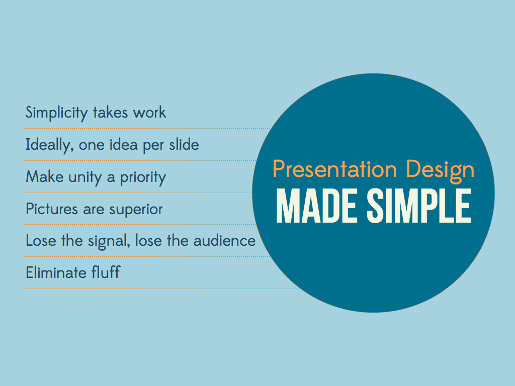
However, when we choose a template and create a seemingly endless repetition of title, bullets, clip art, incongruous transition/animation, we make content more important than the visual presentation or design of that content. So, what’s the solution? Well, you guessed it–it’s time to make presentation design SIMPLE. The six simple design elements are:
The first lesson in the Simple Design series is “simplicity takes work.” Before jumping right into designing slides, we must first prepare ourselves for the design mindset, and that means defining what we mean by work.

When it comes to slide design, one of the first and very honest things I tell students and teachers alike is that paring your work down, resisting the urge to jump right into a template, and being ingenious with the tools presentation software provides you with takes much more work than the opposite. To work towards simplicity, begin by considering three areas.

Firstly, it’s important to analyze the context of the presentation and whether or not slides are truly necessary to communicating your message (yes, they are expected, but are they necessary?). A set of slides, if it’s only decoration, can quickly become a distraction for your audience and can cause them to focus less on what you have to communicate and more on what is happening behind or next to you.
Secondly, if you’ve determined that slides are necessary, you should then create a framework for the presentation by developing a storyboard of your content and organization. One of the most consistent pieces of advice given by professionals like Nancy Duarte, Garr Reynolds, and Steve Cherches is go analog! Get away from that computer (believe me, you’ll spend plenty of time on the computer), use your visual thinking skills, and draw your ideas out. Drawing out your presentation can help free you from the restriction that can come from only relying the imagery you search for (whether it is stock photography or creative commons images/iconography). Drawing and storyboarding also helps you see connection you might miss via the linear layout of a slideshow.
Finally, it’s important to set your slides up for design.

This means beginning with a blank slate, so that you can resist the urge to conform your ideas to a template, as opposed to building a “look for your ideas”; turning on grids and rulers (would you build a house without a way to measure your dimensions?), so you can make precise placement a priority; and familiarizing yourself with your presentation software’s advanced tools such as cropping and image editing, font or typography, shapes, objects, and visual effects, so you can polish your individual elements and overall design.

Whether you use Keynote, PowerPoint, Prezi, GoogleDocs, or Slide Rocket, it’s important to begin with a blank canvas. The biggest detriment to original simplicity is the pre-made template.

Any good presentation software includes features that assist you in designing. Designers make deliberate decisions and consider alignment and hierarchy above all. Using grids, rulers, and getting a “bird’s eye view” of your slides will help you move towards simple design.

Finally, explore your software’s advanced features. Keynote and PowerPoint both allow users to edit and enhance images, for instance, which can help you mold an existing image to fit your original theme.
Once you’ve set your slides up for design, it’s time to move on to the I in SIMPLE Design. Stay tuned for the next installment in this series, in which I’ll cover the glance media rule and its connection to slide design.


Reblogged this on Jitesh A. Panchal's Domain and commented:
KISS… a design methodology that is not only hard to follow but also easy to forget. I can’t stress enough the importance of keeping things simple. Just as the blog states here, it is not so easy to do.
Great post, super simple and clear… On the subject of simplicity 😉
Conor! Thanks for the comment. Did you find that actually getting simple as difficult as I did? I felt like my slides had to fill up all that “blank real estate space”. It wasn’t until I saw Garr Reynolds’ “Blogs are like sharks” example that I really thought, wow, yeah, that is absurdly simple but also has incredible possibilities for complex discussion and analysis!
Yep. Picasso or someone says that genius is in subtraction, not addition 😉
[…] isn’t easy! In this post, Chiara Ojeda begins her Simple Design […]
[…] The presentation, by design firm Stinson Design, calls attention to several of Dee’s suggestions that Stinson Design believes just won’t work for corporate presenters. The deck makes a distinction between corporate and conference presenters based on the level of control one type of presenter has than another does not. Conference presenters, according to the deck ”have control on their content and can decide to present minimal amounts of data” (Source). In contrast, corporate presenters are limited because they must present dense amounts of information and data. The distinction is unclear to me because as a conference attendee, I’ve seen conference presenters display dense amounts of information and data (unfortunately, mostly using bullet points and poorly designed data display), and as a presenter, I was restricted by time, audience type, and subject matter. As someone who has watched four years of “corporate” business pitches, I’ve also seen dense data and complex financial information be presented in a cinematic way that still shows the investor that the presenter is knowledgeable and able to communicate the complex using simplicity. […]
[…] SIMPLE design series covers my six principles for effective visual design. The first piece in this series covered the concept of simplicity in design, with a focus on a very basic truth–simple isn’t easy; it takes work. In this […]
[…] Simple Design: Why Simple Isn’t Easy […]
[…] SIMPLE Design: Why Simple Isn’t Easy […]
font name?
Hey Andy, I used Bebas Neue for the deck Simple Design.
[…] Hey Andy, I used Bebas Neue for the deck Simple Design. […]