
The SIMPLE design series covers my six principles for effective visual design. The first piece in this series covered the concept of simplicity in design, with a focus on a very basic truth–simple isn’t easy; it takes work. In this installment, I’ll cover the next letter in this acronym, “I,” which stands for…
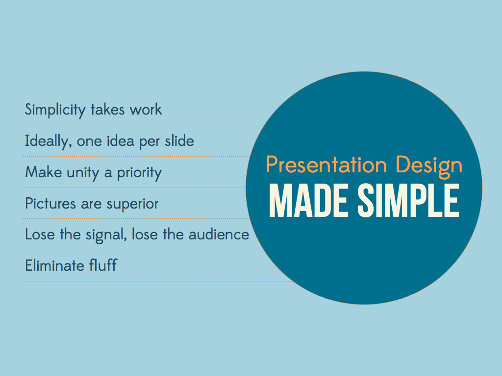
Ideally, One Idea Per Slide

Years of slideument conditioning has led all of us (including me as you’ll soon see) to see our slides as a document, something that is only really complete when filled with content (text, image, clip art, chart, random animated gif). This habit means that we’ve managed to keep our slides low in number, but high in noise (and conversely, low in signal). According to Garr Reynolds, “[p]rojected slides should be as visual as possible and support our point quickly, efficiently (good signal-to-noise ratio), and powerfully. The verbal content, the verbal proof, evidence, and appeal/emotion comes mostly from our spoken word” (Source). So, in a live situation, it’s the presenter and not the slides who must carry the weight of the signal or content. Creating a content-heavy slide places the focus on the visual aid (in the worst way possible), can cause cognitive dissonance and confusion, and can damage a speaker’s credibility. As an educator, I felt the need to fill slides with as much content as possible, especially in courses I felt less than solid in or that required more lecture focus than composition and writing, particularly Latin American Humanities:

What’s wrong with this slide? Well, even when I presented information by only showing one bullet at a time, my students first had no tangible concept to attach to ideas like “universal constructivism”, and second, as John Medina discusses in his must-read Brain Rules, the mind cannot multi-task, which is exactly what we ask audiences to do when we create slideuments. Our audience must read our slides AND listen to us, which they just cannot do. According to Medina, “[r]esearch shows your error rate goes up 50% and it takes you twice as long to do things” (Source) when the myth of multi-tasking is in play. Further, as Nancy Duarte asserts in Slide:ology, slides, like billboards are “glance media”, which means that your audience should be able to process your visual story quickly and then return to listening to your awesome content.

The situation becomes even more complex when we are asked as presenters to provide our slides for publication or when we use our slides as study guides for our students. How do we keep our slides cinematic AND also communicate dense amounts of content? Reynolds has a few suggestions, including the most obvious and useful one–create a set of display slides and create a separate document with complete notes (Source). I find that doing this gives students the opportunity to use their critical thinking skills and decide what is really important or note worthy. I want to share one of my most important design epiphanies that helped me find a good balance between content and design. Keeping this idea in mind has helped me move towards truly SIMPLE Design: An Extra Slide Costs Nothing!

So, instead of placing every bit of information about Joaquin Torres-Garcia and Universal Constructivism on one slide, I can break the information up over many slides.


Have you faced the challenge of creating cinematic slides that are also content-rich? What are your great ideas for moving away from the slideument?


